
Where Art Meets Interior Design (part II)
Updated 12 November 2021 / first published: 2 March 2020
In November 2019, we attended an art exhibition of a different kind, in which two art forms came together in a symbiotic visual aesthetic and chic utilitarianism. This exhibition, which incorporated paintings, sculptures and studio art pottery, used a neutral canvas, the novel form and proportions of which comprised a number of empty rooms in what was at that time an incomplete apartment block, except that is for one flat, where a unique and innovative makeover had achieved space-saving functionality but at no cost to style and novelty.
As with any art exhibition, the objective here was to bring works of art, and the artists who create them, into the public eye. The works displayed could be enjoyed for their cultural merit purely in the space and time that they occupy for the life of the exhibition or, if the beholder so desired, at their leisure privately and naturally for a price. However, and this is where the concept differs, once interest is stimulated it is hoped that potential art purchasers will experience a carry over into the functional realm of personalised living space where the wider appeal of lifestyle aesthetics prevail. All that is needed is vision, and, of course, the requisite roubles.
Clutter above minimalism
By no stretch of the imagination am I a man bowled over or easily swayed by modernism ~ contemporary that is ~ or by minimalism of any kind: give me a fussy, over-cluttered Victorian drawing room any day. However, I must have enjoyed the first exhibition, because I was looking forward to attending the second.
The previous venue had been a modern apartment block, whereas, in contrast, our invitation and curiosity took us this time to a wonderful Gothic building, somewhat jaded by the vicissitudes of time but to its melancholic benefit rather than its detriment.

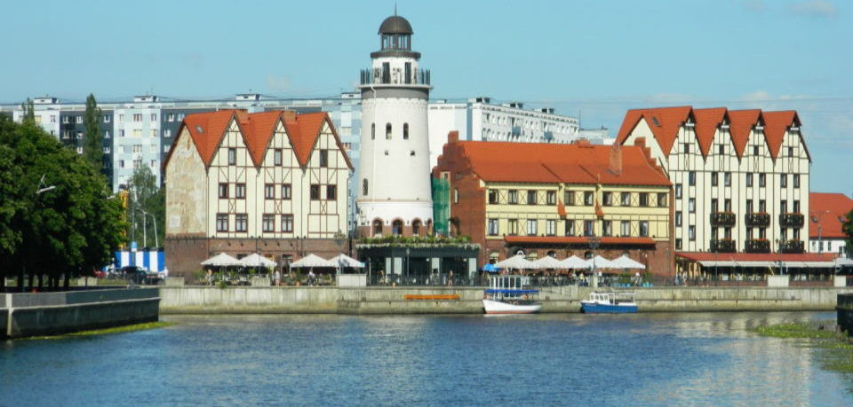
Kaliningrad art exhibition
The exhibition was being held on the first floor of this not insubstantial building. We had encountered trouble in finding the building itself, so without prior instruction as to where we were to go and with no signs in evidence to point us in the right direction, it was more by chance than skill that we tried a door at the side of the building, thereto discovering a small narrow staircase which would lead us to our destination.
The one flight of stairs, screened off by a series of pink vertical rectangular struts, led us into a room which was a living work of modern art. It had what we will call the ‘Wow’ factor.
But first the exhibition itself.
Kaliningrad art exhibition
With the exception of three or four artworks that had been hung in the Wow room, most of the paintings were to be found literally strung out along both walls of a lengthy corridor. Others were exhibited in an adjoining room, and two more ~ old friends of ours from the previous exhibition ~ had been consigned to the far end of the corridor, a good choice as the black walls and black floor tiling flecked with tiny white fracturing ripples heightened the tension inherent in these works.

Whilst the abstract paintings ~ total abstracts ~ suited the environment perfectly, my artistic and emotional prejudice steered me yet again into the arms of the painting after which we had lusted at the previous exhibition but sadly could not afford. This was the painting by Yri Bulechev. It is depicted here (see photograph below), along with its price tag of £2000.

Perhaps if I volunteer to mix the paints for the artist, he might be persuaded to give me a discount.

The ‘old friends’ to which I referred earlier, hanging on the appropriately dark wall, were works by an artist who, in keeping with the enigma of his/her art, we have not been able to identify. Once again, of all the artwork displayed here, their enigmatic quality took precedence, although, conversely, I was also attracted to the 1950s’ industrial scene, a painting in the realist mode of a Soviet factory or processing plant.


At the opposite end of the corridor to that where the enigma paintings hung was an impressive collection of large studio art pottery, floor-standing vases of prodigious proportions, staple must-have items back in the 1960s, statements then of contemporary modern chic, which today were completely in keeping with the décor of the reception room through which we had passed on our arrival. For whilst this room was the very epitome of contemporary modernism, there was no concealing the fact that certain crucial elements of its aesthetic composition owed their manifestation to the iconic preoccupations of 1960s’ designers and artists.

The stone sculpture of a man’s head and face possessed no such subtle nuances. It was a strong face, an indomitable face, and as it sat there on its plinth daring me to stare at it I was put in mind of tricky situations encountered in my youth, mainly in public houses, which went something along the lines of: “’ere mate, are you starin’ at me?!”.
This would seem as good a time as any to retreat from the corridor into the Wow room.
First, I should explain that unlike the earlier exhibition this one was not being held in an empty apartment block but in a partly occupied suite of offices. On this occasion unchaperoned, the exact nature of the tie-in between art and interior design had not been explained to us, but I think we can assume that the logic behind it was that you too could have an office like this styled to your personal taste.
In this particular made-over office block the Wow room was the reception area. It was large, with a fairly long desk to the left of the pink-painted and glass-panelled entrance door and, to the right, a seating area for visitors, a place to unwind, eat snacks and drink coffee.


I still think that it would make a nice bar!
The furniture conformed to the modern predilection for non-conformity, ie an anthology of different furnishing styles. In the centre of the room the tables were round-topped, raised on slender pedestals and supported by circular bases. There was no mistaking their 1960s’ credentials. Fronting the reception desk, or counter, stood high square-section stools fitted with back rests, whilst a long light-timbered bench seat sprinkled with cushions and traversing one of the walls provided seating at a series of tables of typical square construction. But it was the chairs in the middle of the room that wrested continuity from divergence.

Made of a transparent acetate material, their pierced, convoluted and intertwined design virtually stole the show. However, there’s no business like show business and no show business without getting the lighting right. And here was the real show stealer. The lighting in this room was pure creative brilliance.


In reverse order of merit, the wall lights, ceiling lights and sconces in pierced and modern brass had obviously been purchased from Del and Rodders, but there gauche intrusiveness contributed an eccentric out-of-place rivalry to the blended effect achieved in the suspended hang ’em high and sling ’em low mid-20th century pendants, each one equipped with white, minimalist, cushion-shaped shades. One interesting divergence on this theme was the inclusion of a slightly different variety. It was a pendant lamp with the same long wire attachment but with a shade entirely composed of looped vinyl tubes.
Staying with the suspension theme, the lights above the bar (sorry, my mind must be wandering, I meant reception desk) were plain enough, with their straight glass shades, but something odd was going on here because each light appeared to contain three overlapping bulbs of different colours, whilst, in point of fact, although each fitting contained a different coloured bulb, each pendant only had room for one bulb. On reflection, I was glad that the reception desk was not a bar!

Nothing much needs to be said about the beam-suspended spot bars focused upon the wall-strung paintings, except that they did their job, but the real feather in the lighting cap, the unproverbial pièce de résistance, was the violet light emanating from a complete wall of corrugated vinyl, similar in its ribbed construction to the translucent two-ply material favoured in this part of the world for screening on garden fences. At a guess, I would say that the light source contained within this material consists of coloured LED strips and that the intensity and suffusing quality is controlled by the filtration and the refractive mechanism exerted by the material’s density and the patterned texture upon its surface. I suppose you would agree?

As an interesting and unusual light source, this lightweight wall is fascinating, but further joy is derivable from the central pivoting section, which fulfils the function of a revolving door. So super-sensitive is the mechanism that all it takes is the touch of a finger to set the door in motion, turning the whole partition around smoothly and quietly on its axis.
I know I have spent an inordinate number of words and time waxing lyrical about lighting, but, lest it should be underestimated, the golden rule is that no interior design work, whatever it is or wherever applied, will ever ‘cut the mustard’ without due regard for lighting. Mark my words, if the lighting is not right everything else will be wrong.

Leaving the lightshow behind, reluctantly, I crossed back into the corridor. I noticed that every door in the corridor was uniform, a light mat beige-brown framework infilled with fielded panels of vinyl. I like these doors, I thought, but I was not so sure old stone face did. He was looking at me again, so I shot a glance at the ceiling.
Ahh, yes, there it was, the exposed industrial look found in every restaurant, café, bar and office from here to the land of Nod. Discard the false ceiling, let the silver-tone ventilation tubes be proudly and unashamedly seen in all their heavy-weight glory, together with water pipes, electric cables and everything else that used to be hidden. But then as Henry Ford supposedly famously said, “If it ‘aint broke don’t fix it”, and it seems to work for everyone, for the time being at least.


The last stop ~and it usually is ~ was the toilets. We were not going there to review the interior décor, but we were compelled to do so as an adjunct to the mission in hand. Our appraisal started with the toilet doors themselves. There were three doors, turquoise with lattice-work surfaces, strung out in sequence in the enigmatic-paintings’ section, where the walls and the floor tiling were predominantly black.
On the other side of the toilet door, the marbling effect had turned to grey and white. The variegated tiles left the floor and travelled up the wall behind the toilet pan, where a small shelf above was dressed in small mosaic. The walls on either side were covered in an intriguing silver highlighted paper, the illustrated pattern on which was fish. I am not entirely convinced that I like the idea of fish swimming around in the toilet but at least to the best of my knowledge these fish were not piranhas.

I came away from this event still wanting the paintings whose cost I could not justify but whose value I could not argue with. As for the idea of a 21st century office complete with touch-responsive revolving acetate screen emitting room-bathing violet light, this scenario most definitely appeals to my love of the unconventional, but to rubber-stamp the investment I feel that I need to become a lot more important than I am at present. You, no doubt, are in a different league. So go on, why not treat yourself? You know that you deserve it!
Essential Details:
Exhibition: ‘Картинный вопрос 2.0’
The exhibition is a joint offline project of the Centre of Communication Rezanium
Tel: +79114679280
Web: www.rezanium.com
Project Organiser
Natalya Stepanyuk, Exhibition Curator & Artist
Interior Design
Anton Besonov
For more information, contact
Natalya Stepanyuk
Tel: +79062371001
Email: mail.artspace.gallery@gmail.com
Email: stepanyuknm@gmail.com
Copyright © 2018-2021 Mick Hart. All rights reserved.